

Getting Started with Spreadsheets — No Experience Required
Learn how to set up your first spreadsheet, enter data correctly, and use basic tools. We'll walk you through everything step by step.

Master the tools that'll make your documents look polished. Covers headings, spacing, fonts, and how to organize information so it's easy to read.
Here's the thing — a poorly formatted document is harder to read. Period. Bad spacing makes your eyes work too hard. Inconsistent fonts look unprofessional. And if someone can't quickly find what they're looking for, they'll get frustrated.
We're not talking about being fancy or creative here. We're talking about making your documents functional. Whether you're writing a letter to a government office, creating instructions for family, or documenting something important, good formatting makes everything clearer. And the best part? Most of it's simple once you understand the basics.
Think of headings like signposts. They tell readers where they are and what to expect next. When you use them properly, people can scan your document and understand the main points in seconds. That's powerful.
Most documents need just 2-3 levels of headings. Your main title is Heading 1. Big sections underneath are Heading 2. If you've got subsections, those are Heading 3. Don't go deeper than that — it gets confusing. And never skip levels. You wouldn't jump from Heading 1 straight to Heading 3.
Here's what many people get wrong: they use bold text instead of actual heading styles. Bold text looks similar, but it doesn't work the same way. Real heading styles make your document easier to navigate and they actually help with accessibility. So use the heading buttons in your toolbar — not just the bold button.
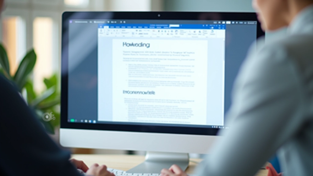

Bad spacing makes even good content feel cluttered. You'll notice this in documents where everything's squished together — your eyes get tired just looking at it. The solution isn't complicated: you need breathing room.
Start with paragraph spacing. Between each paragraph, add 6-12 points of space. In Word, you'll find this in the Format menu under Paragraph. Don't hit Enter multiple times to create space — that's the old way and it causes problems later when you need to edit.
Margins matter too. Standard margins are 1 inch on all sides. If your document feels cramped, you could try 1.25 inches. But don't go smaller than 0.75 inches — your text will feel squeezed. And line spacing? 1.15 or 1.5 makes documents comfortable to read. Single spacing works for some formal documents, but most benefit from a bit more air.
Learn how to set up your first spreadsheet, enter data correctly, and use basic tools. We'll walk you through everything step by step.
Stop doing math by hand. We'll show you the formulas you'll actually use — addition, averages, and how to count things automatically.

It's frustrating when files disappear into your computer. This guide covers folders, naming systems, and backing up what matters.
The font you choose affects how professional your document looks. You don't need fancy fonts. Honestly, you're better off sticking with simple, readable options. Times New Roman, Calibri, and Arial are classics because they work.
Here's the rule: one font for your whole document. Pick one that's easy to read and stick with it. If you want emphasis, use bold or italics — not a different font. Size matters too. Body text should be 11 or 12 points. Anything smaller than 10 points gets hard to read, especially on screens.
One more thing about fonts: if you're sharing documents with others, use fonts that most computers have. Fancy fonts might not display correctly on someone else's machine, and your beautiful formatting falls apart. Safe fonts are always better than risky ones.

Editorial Team
Written by the barodainsurance editorial team, focused on practical, accessible guidance for midlife digital learners.
Digital tools and platforms change over time. The steps we've described here work with Word, Google Docs, and most document editors — but check your specific program's menu if something looks different. Features get updated, buttons move around, and new options appear regularly. Take your time getting comfortable with anything new, and don't hesitate to explore your program's Help menu. That's what it's there for.
Good formatting isn't about being fancy. It's about respect for your reader. When you use proper headings, smart spacing, and readable fonts, you're saying "I care about this document and I want you to understand it easily."
Start with these three things: organize with headings, breathe with spacing, and keep fonts simple. Once you master those, your documents will look professional without any extra effort. And when you need to edit or share them later, you'll have a solid foundation to build on.
The skills you've learned here will work in any document editor you use. Whether you're working in Word, Google Docs, or something else entirely, these principles stay the same. You've got this.